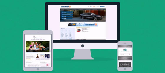
Ever visit a website on your cellphone only to find that half of it is cut off? Annoying right? Now imagine you are a business owner and an interested customer stumbles upon your page while browsing on their iPad but has to adjust orientation, scroll, and zoom out just to get to the contact page… You can probably kiss that lead goodbye.
With more and more web searches being done on cellphones and tablets (approximately 60% of all searches today) it is vital that your website be able to accommodate varying screen sizes and operating systems. At Vincent James Marketing LLC, every website we design is responsive. What is responsive web design, you ask? Let’s get to it!
With more and more web searches being done on cellphones and tablets (approximately 60% of all searches today) it is vital that your website be able to accommodate varying screen sizes and operating systems. At Vincent James Marketing LLC, every website we design is responsive. What is responsive web design, you ask? Let’s get to it!
What is Responsive Web Design?
Versatility is the Name of the Game
Most simply, responsive Web design is a development approach that allows a website to seamlessly adjust for different screen sizes, devices, and orientations. The nuts and bolts behind this concept, however, are a little more complex. The build is made up of a mix of malleable code media queries, frameworks, fonts, and pictures. So, as the user switches from their cellphone to their tablet to their desktop the website will automatically switch around accordingly based on resolution, image size, and scripting abilities. Responsive web sites therefore have the important ability to stay out in front of new and emerging technologies and impress even the most tech-savvy browsers and young consumers.
Get a great price and wow your customers with a responsive, custom web build from the pros at Vincent James!
Benefits in Search Engine Response Pages (SERPs)
In addition to their presentation, responsive web designs also have a variety of other powerful benefits. The advantage of Search Engine Response Pages or SERPs include:
- Faster Load Times – No redirections necessary. Also important is the fact that Google and other search engines rank faster loading sites higher than slower ones.
- Link Building – Building links to responsive pages means higher quality backlinking, which means better SEO sores.
- Decreased Bounce Rate – If the site looks good on any medium, browsers are more likely to stay and browse, thus increasing search engine strength of the SERP.
- Cost Effective – Rather than having to pay to build a mobile version of your site you can build one site for all devices and likewise use a singular URL to help focus traffic and boost your brand.
Modern Web Design In Action
Utilizing essential digital tools like responsive design improves your score in search engines, saves you money, and lends your brand immediate credibility. As tablet and smartphone use become the norm, responsive design is vital in order to keep up with emerging technologies and stay ahead of your competitors.
Check out our full list of services and see how Vincent James can help produce an effective digital marketing infrastructure that targets ideal customers and boosts your bottom line.

